University of Nevada, Reno professor designs new font based on Northern Nevada cattle brands.
In contemporary marketing terms, the word branding brings to mind a memorable logo, catchy tagline, or bold color combinations. In a historical sense, the word is a much older and deeper part of agricultural history.
Iron brands have been used to mark cattle and other livestock with symbols of ownership since ancient Egypt and still are in use today. Over time, the practice of marking goods for sale gave rise to the modern logo. Now, a University of Nevada, Reno professor is bringing the brand story full circle.
While the iron’s hot
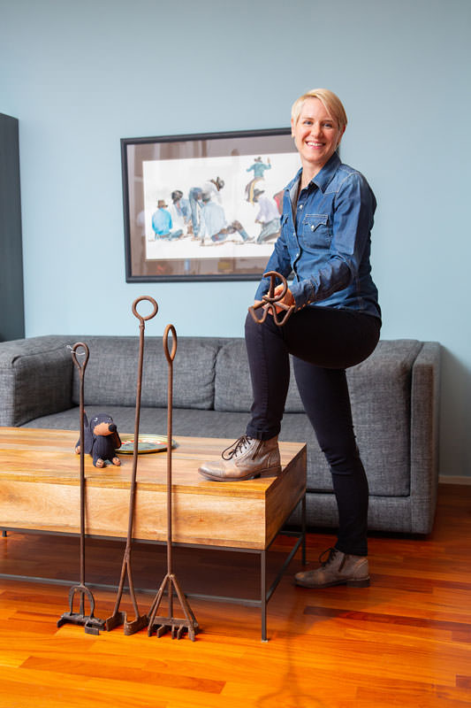
Monica Maccaux, assistant professor and director of graphic design at UNR, was intrigued and inspired by a branding iron she saw in a Reno antique store. After some research on the history of the practice, she realized that no other designer had created a typeface based on cattle brands.
“I found some books on branding irons and all the different styles,” Maccaux says. “These are all simple, hand-drawn styles, so I thought it would be cool to do a font face.”
The design took Maccaux a little more than a year to research, hand sketch, and draw digitally in a program called FontLab Studio. Maccaux then collaborated with PSY/OPS Type Foundry in San Francisco on the coding and post-production of the font.
The new font, Ranch Style, consists of six variations of letters, numbers, punctuation, and design icons. Maccaux even created a series of barbed-wire designs. The font variations include classic cattle brand terms such as walking (a letter or number with legs), flying (with wings), lazy (on its side), and crazy (upside down).
Cattle brands lend themselves wonderfully to a font design. Their basal lines work for both clear communication and sparing livestock from being marked by an overly complicated hot brand. In addition to creating fonts, Maccaux also has started accumulating iron cattle brands for a collection of her own.
In addition, Ranch Style is not her first font design. Previously, Maccaux created another font for PSY/OPS called Motorix inspired by electronic music and human motor skills. Her Ranch Style font will be available for purchase via PSY/OPS Type Foundry sometime this spring.”
“I’m not really driven to make money off of it,” Maccaux says. “I just want to create things and get it out into the world and see people use it. It’s a quirky and very specific font for certain designs.”
As a graphic designer and former rancher, writer Christina Nellemann knows the work that goes into both font design and cattle brand design.